@OwlyJulie
July 29, 2014
Triangle Lovers
With so many of the recent brand refreshes that are going on, I can’t help but think that Telly Monster’s ‘Triangle Lovers Club’ is real.
Triangles are simple polygons, with 3 sides, and live on the two dimensional plane. Mathematicians could speak at length of the beauty of triangles and all of the laws, theorems, and points and lines involved. Though trigonometry was never one of my favourite subjects, I did know my way around a triangle.
Perhaps the triangular popularity began with the triangular shapes of the geodesic dome, mid-century modern architecture, or even with the hipsters.
Modern rebranding seems to be favouring the triangle as a minimalist shape that is all encompassing of a brand’s identity. Will the 2010s become know as the time when brands shifted to triangular solutions? Will we have a surge of rebranding work in the 2020s to compensate for this triangular trend? Only time will tell.
Here are some of the most recent brand refreshes featuring a triangular solution.
Budget Rent-a-Car
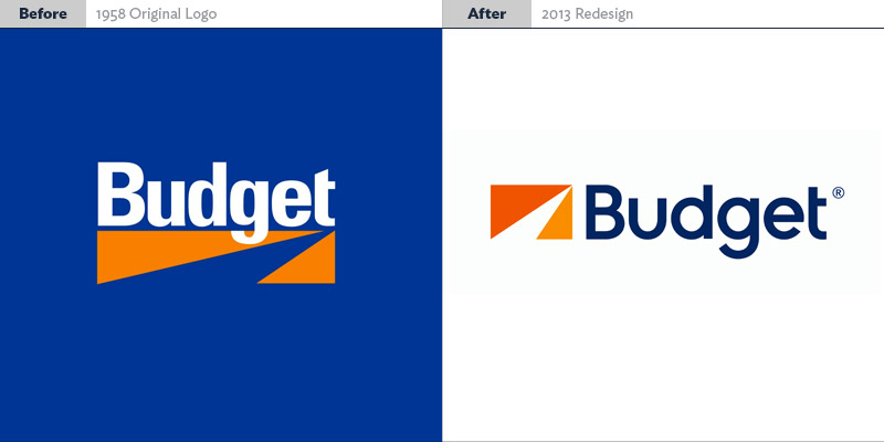
Analysis: They’ve made more of a logo/mark with the basic triangle shapes, but completely lost the “road going into the distance” metaphor. The font is much more modern but it’s a bit too “round” to have the same impact as the previous logotype. There’s very little contrast now, everything sits rather calmly and doesn’t make too much of a statement. It’s a very “weak” logo now where as the original—while dated—was perfectly suited to the company.
National Arts Centre
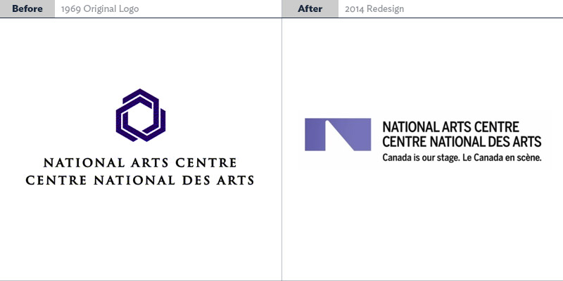
Analysis: The NAC brand hadn’t been touched in 45 years, and perhaps it should have stayed that way. The old NAC logo was a wonderful playful geometric shape that actually mimics the architecture of the buildings. While the typeface and overall styling could have used an update, the new “solution” is far from distinct or successful. We get it. It’s a spotlight. Very clever. Oh it forms an “N” shape kind of? GEE. HOW ORIGINAL. The typeface is as generic as the new logo, so maybe that’s a win?
The Ottawa Citizen
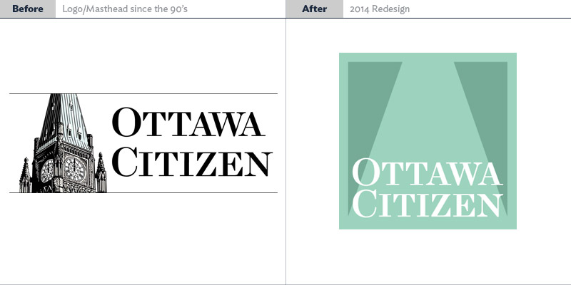
Analysis: This is the worst “triangle lover” yet, and a perfect example of a company throwing out their entire cultural/corporate heritage for a passing fad. It’s so “App Fantastic” it makes us sick. I mean…at least they left the type alone? This logo must have taken about 10 minutes. It’s “minimalism” done by someone who doesn’t understand what Minimalism actually is. They will rebrand again within two years at great expense I guarantee it. Like Budget’s logo, they’ve completely cut their brand’s head off, and removed anything that was unique or memorable or interesting. They could have added some subtle cues to hint that the triangle shape was the Peace Tower, and it still could have been “minimalist”. (Personal note: This is such a misunderstood art form, people need to learn them some Bauhaus philosophy.)
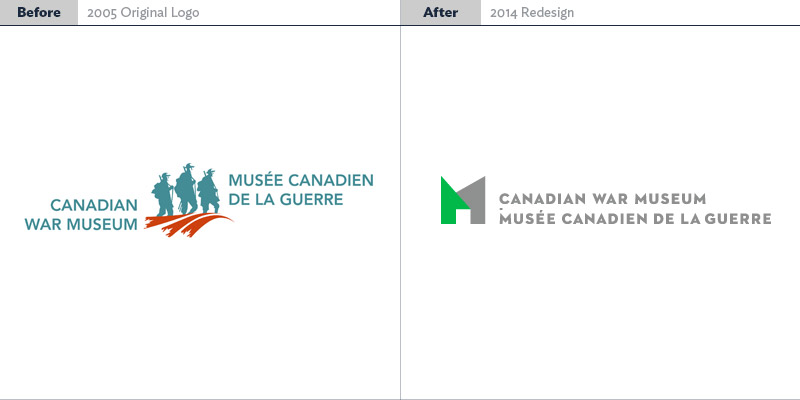
Canadian Museum of History
Analysis: Lastly, we have the same designer who did the NAC doing a kind of okay job. The old logo was a cacophony of ideas—an obvious “frankenlogo” where too many cooks get to insert their ideas and you get this…mess. The shape definitely reflects the actual building somewhat, and the font is much more appropriate (actually I really, really like it. It’s right out of a 1940’s propaganda poster, so props to the designer for that). But, sadly, the mark itself just has no ‘spunk’, no ‘elan’ as French WWI soldiers would say. There’s just nothing memorable that really works. You would have to see that logo dozens of times before you finally started associating it with the company.
